Our brand, documented.
Everything that makes 3D Soft Tech look and sound like 3D Soft Tech — logo rules, colors, type, and voice. If you're putting our name on something, start here.
Two colorways. Zero improvisation.
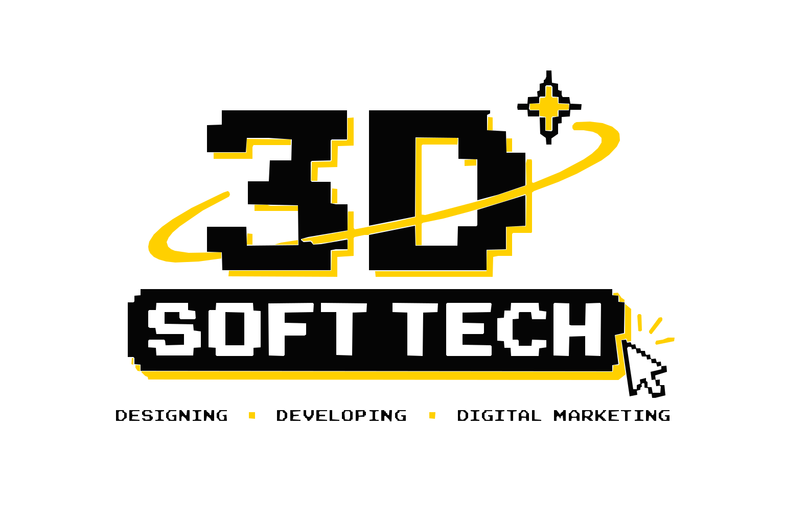
The standard mark lives on light backgrounds; the reversed mark lives on dark ones. That's the whole rule — please don't invent a third.
Do
- Keep clear space around the logo equal to the height of the "3D" block, on all sides
- Use it on solid black, white, or paper backgrounds
- Scale proportionally — corners stay square, pixels stay crisp
- Use the "3D" icon mark alone for circular avatars and favicons
Don't
- Stretch, skew, rotate, or "just nudge it a little"
- Recolor the wordmark — the palette below is the palette
- Place it on busy photos or gradients
- Add drop shadows, glows, or smoothing — pixel edges stay sharp
Four colors. One of them does all the shouting.
A monochrome core pulled straight from the logo, with arcade amber reserved for calls to action, highlights, and moments of energy. If everything is amber, nothing is.
Two typefaces, two jobs.
The pixel face carries the arcade identity — headlines, in caps, used sparingly. The body face carries everything that actually needs to be read.
3D Soft Tech
For logo lockups, section headers, and short taglines. Never for paragraphs — pixel fonts lose legibility below 18px and over long lines.
3D Soft Tech partners with brands to design, develop, and market their way to growth — pairing sharp visual identity with reliable engineering and campaigns that convert.
For all body copy, posts, captions, and proposals. Regular for body, Bold (700) for emphasis. IBM Plex Mono handles labels, tags, and fine print.
"Designing. Developing. Digital Marketing."
The tagline is the pitch. Everything we write should sound like a smart friend explaining something — not a brochure trying to impress a boardroom.
Direct
Short sentences. No jargon padding. Say what the work does.
Confident
State capability plainly — let the three D's speak for themselves.
Energetic
Arcade DNA means momentum — active verbs, forward motion.
Grounded
Every claim backed by a service, a result, or a client outcome.
Where the logo goes, and how big.
Proportions are given as a percentage of canvas width, so they scale correctly at any resolution. When in doubt: smaller logo, more clear space.
| Placement | Canvas | Logo width | Margin | Mark used |
|---|---|---|---|---|
| LinkedIn feed post | 1200×1200 | 14–18% | 6% from edge | Icon or full lockup |
| Instagram feed post | 1080×1350 | 12–16% | 6% from edge | Icon or full lockup |
| Instagram / LinkedIn story | 1080×1920 | 60–75% | Centered, 10% top | Full lockup |
| Profile picture / avatar | 400×400 | 55–65% | Centered | Icon mark only |
| LinkedIn cover banner | 1584×396 | 30–36% | 5% left margin | Full lockup |
Building something with our brand?
Grab the logos above, stick to the palette, and if you're ever unsure — just ask. We'd rather answer a question than fix a stretched logo.
Get in Touch